People are going to make mistakes. Thoughtful designers will minimize the consequences of those mistakes.

Image by Ryan McGuire from Pixabay
Requirements explorations naturally focus on the product’s expected behavior when everything occurs normally. However, experienced business analysts, software designers, and developers must also think about the many things that could go wrong. They should consider how to prevent these problems if possible and to detect and handle them if they occur anyway.
Error conditions in software are called exceptions. If you don’t identify exceptions and determine how to handle them during requirements development, the designer might overlook some possible failure conditions or unexpected user actions. Those oversights can result in unpleasant surprises when a user later encounters the unhandled exception.
A good design makes a product easy to use correctly and hard to use incorrectly. You can’t always prevent every error, but design the product to make it hard for the user to make a mistake and easy to recover from them.
Prevent User Errors Whenever Possible
Tiger Technologies hosts my websites and email services (I highly recommend them, BTW). Their website isn’t glitzy, but it’s functional, easy to understand and use, and designed to minimize user mistakes.
Suppose I need to delete an email address (mailbox) from my account. As Figure 1 shows, the website first cautions me about the implications of the deletion and asks if I’m sure I want to proceed. I must check a box confirming the deletion, which then activates the button to delete the mailbox.
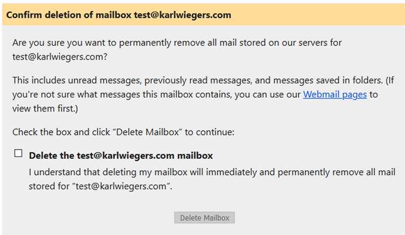
Figure 1. The dialog to confirm the deletion of a mailbox at my hosting provider makes it hard for me to do something destructive by mistake.
Even then, when I return to the email management page, a message reminds me that I deleted the mailbox and tells me how I can restore the mailbox and its contents if I wish to (Figure 2). They generously give me thirty days to realize I made a mistake and recover the deleted mail. Thanks, Tiger Technologies!
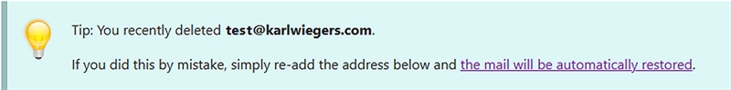
Figure 2. Even if I do delete a mailbox by mistake, I can easily restore it.
As a counterexample, my PC backup software permits me to restore a file from a backup even if the destination folder contains a newer file with the same name. It overwrites the newer file with no warning or protection. That’s a thoughtless design that could easily trash a lot of your work. A better design would detect the risk and then offer several options:
- Cancel the restore operation.
- Restore the old version to a different folder or with a different name, perhaps suggesting a new name that distinguishes the two files.
- Let me rename the current version of the file and then restore the old version with its original name.
- Proceed with the overwrite, checking again to make sure I really, REALLY want to do that.
Make Recovery Easy
Users are going to make mistakes. They enter data formatted differently from what the system expects, or they start down a path but then change their minds. Systems are also going to experience failures. Failures could be transient, such as a flaky network connection, or they could be due to some deficient design approach that paints users into a corner. You can’t prevent every error, but let’s help the user recover from one.
The Case of the Mysterious Message
My friend Scott was providing some feedback on eBay about a seller from whom he had bought a product. Scott wanted to compliment the seller for being particularly helpful in resolving an issue. When he tried to submit his comment, Scott saw this perplexing error message, shown in red:
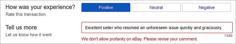
Figure 3. This error message from eBay’s feedback form was puzzling.
Scott’s message didn’t contain any profanity, so this message baffled him. He discovered that eBay accepted his comment if he changed it to “Excellent seller that resolved an unforeseen issue quickly and graciously.” Ah, there’s a clue. I’ll leave it to you to discern precisely what might have bothered eBay’s input-checking software.
We could be wrong, but Scott and I guessed that the website strips blanks from user-supplied text before checking for words on eBay’s naughty list. That makes no sense. If you remove blanks between words before performing some lexical analysis, then what you have left is, well, not words.
There are two instances of thoughtless design here. The first lies in the algorithm apparently being used to scan comments for eBay’s notion of “profanity.” That algorithm generated a false positive, rejecting a perfectly fine user comment.
The second design shortcoming is to report an error without telling the user precisely what the problem is. How can you correct an error if you don’t know what’s wrong? Had eBay highlighted what it interpreted as offending characters, Scott would have figured out the problem immediately. It wasn’t his error at all.
The Case of the Forced Completion
I have occasionally used a website or software application that forced me to complete a task I began, even if I changed my mind partway through and didn’t want to proceed. Maybe I discovered that I lacked a needed piece of information, or I realized that I didn’t have to perform that task after all. Shouldn’t I be able to bail out of the task easily?
While completing a survey online, maybe I’d like to change a previous response, but there’s no way to do that. Sure, I can exit from the application, close the browser tab, or use the browser’s back button to return to a previous page and start all over. But that’s not the same as using designed-in logical ways for me to back up, cancel, or undo what I’ve done. I wish those site designers had heeded this lesson:
Give the user options to exit from a task or to return to a previous step.
Considerate designs will remember data the user had entered previously or allow users to save an incomplete task for possible future completion. Sometimes I’ve had to reenter information on a form multiple times because the input fields were blank when I returned to a previous page. Maybe it takes more design, coding, and testing effort to provide those options. But users cumulatively waste far more time because of poorly designed applications.
A diagram called a dialog map can help ensure you include appropriate reverse navigation options. A dialog map depicts the architecture of a proposed user interface design. Figure 4 illustrates a dialog map for an online survey application. Each rectangle represents an individual dialog element, such as a screen, web page, menu, or dialog box—any place the user can interact with the app. The arrows show the allowed navigation pathways between one dialog element and another. Labels on the arrows indicate the action the user takes to cause each navigation.
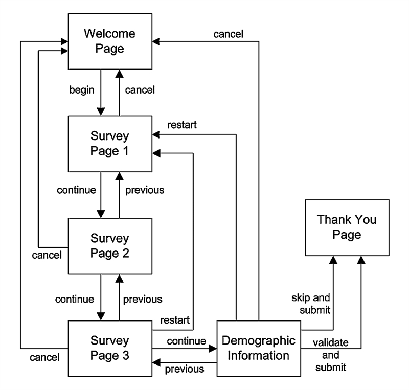
Figure 4. Drawing a dialog map for an online survey application ensures a user interface design that lets the user back out of an operation smoothly.
You can trace through a sequence of arrows in a dialog map to visualize how the user will interact with the system to accomplish the task and to see how the system will handle various alternative scenarios. Figure 4 shows that the user can cancel out of the survey at any point and return to the welcome page. Choosing to restart the survey takes the user back to Survey Page 1. Of all the many visual analysis models I’ve used in my software career, the dialog map is my favorite.
A dialog map can also reveal missing requirements, actions a user might want to take but cannot with the present design concept. Recently, I visited someone who lives in an apartment building with a locked outer door. I must call her phone using an intercom panel so she can buzz me in. She was on the phone when the intercom called her, so my call rolled into her voicemail. However, the intercom’s control panel did not provide any obvious way for me to hang up so I could try to reach her again in a couple of minutes. Drawing a dialog map to think through all the issues involved with making an intercom call might have revealed that problem.
Another common functional absence is the inability to correct a mistakenly pressed elevator button. To summon the elevator, maybe I accidentally pressed the “down” button instead of “up,” but I can’t cancel that action. Once I’m in the elevator, perhaps I inadvertently press a button for the wrong floor. Without an undo function for elevator buttons, people must take side trips to the wrong destinations. I wonder how many cumulative hours people waste each year on those unplanned excursions.
People are going to make mistakes. Good product designers will strive to minimize the consequences of those mistakes. Prevent errors when you can, and make it easy for users to recover when something does go wrong. Your users will appreciate the consideration.
Author: Karl Wiegers
This article is adapted from The Thoughtless Design of Everyday Things by Karl Wiegers. Karl is the author of numerous other books, including Software Requirements (with Joy Beatty), Software Requirements Essentials (with Candase Hokanson), Software Development Pearls, and Successful Business Analysis Consulting.